2015 - 2016 @Linkedin
Visit the site
Linkedin is the world-leading professional networking platform, however, it turned out not as many Linkedin members were using Linkedin to look for jobs. Platforms like Indeed who’s specifically designed for job search were more popular among job seekers.
In 2015, I joined the newly assembled job search team and led the re-designed of LinkedIn’s job search product for desktop and mobile web to attract more job seekers to the platform. In a year, I partnered with one product, a group of 10 engineers and one user researcher, together we designed, developed and delivered the new job search experience to over 500 million users.
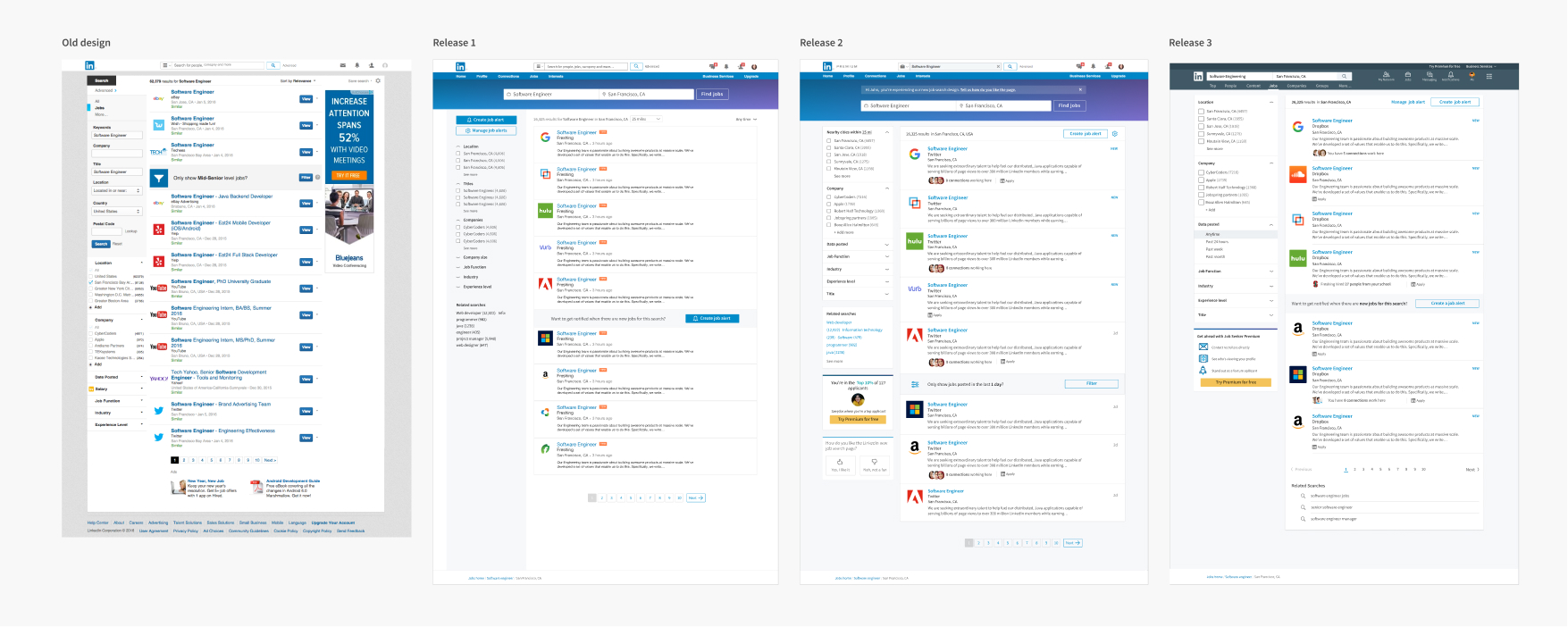
The project started right in the middle of Linkedin’s migration and rebranding. The combination of a fixed release date and aggressive scope required high coordination of design and development. New feature design and migration work were broken into parallel workstreams. I worked, on one hand, migrating existing components with the new design system, reviewing and aligning with the design system designers. on the other hand, design and testing new features with products.
During my time at Linkedin, I worked on three big releases of job search and numbers of testings within each release. I worked together with the product manager defining each iteration of the job search and setting mini-goals for the next one.
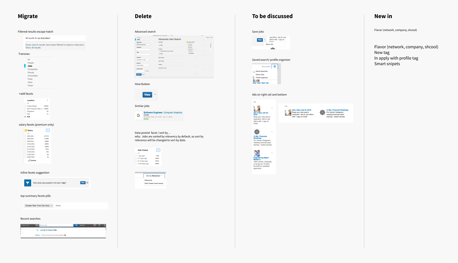
The project started right in the middle of Linkedin’s migration. Our immediate goal was to come up with a migration list to ensure feature parity. We wanted to take this chance to get rid of the low performing features so that we have a clean slate to start with. To achieve so, I worked with my product manager to map out each individual feature and its performance. We grouped all features into four categories: 1. Keep and migrate; 2. delete; 3. to be discussed; 4. new in.
We knew that just deleting a bunch of low-value features was not enough, and we need directions on how to improve. Therefore I reached out to the research team and requested conducting user research to find out how people search for jobs online and what frustration job seekers have by using online tools, especially Linkedin. After two weeks of deep-dive interviews with LinkedIn job search users and here are what we discovered:
I shared back the potential directions with the team and conducted a workshop to brainstorm ideas. We generated sprang across many different directions. They were exciting but also ambitious. To act upon these ideas, we went through a ruthless prioritization by weighting the user impact and development resource. Eventually, we were able to come up with a high-level requirement for MVP, which includes:
On top of that were the continuing work of improving search quality and ranking to keep the business running. For the features that didn’t make the cut, we keep a shortlist of them to explore in the future, including salary and market insights, and new interaction to quickly view job detail and compare.

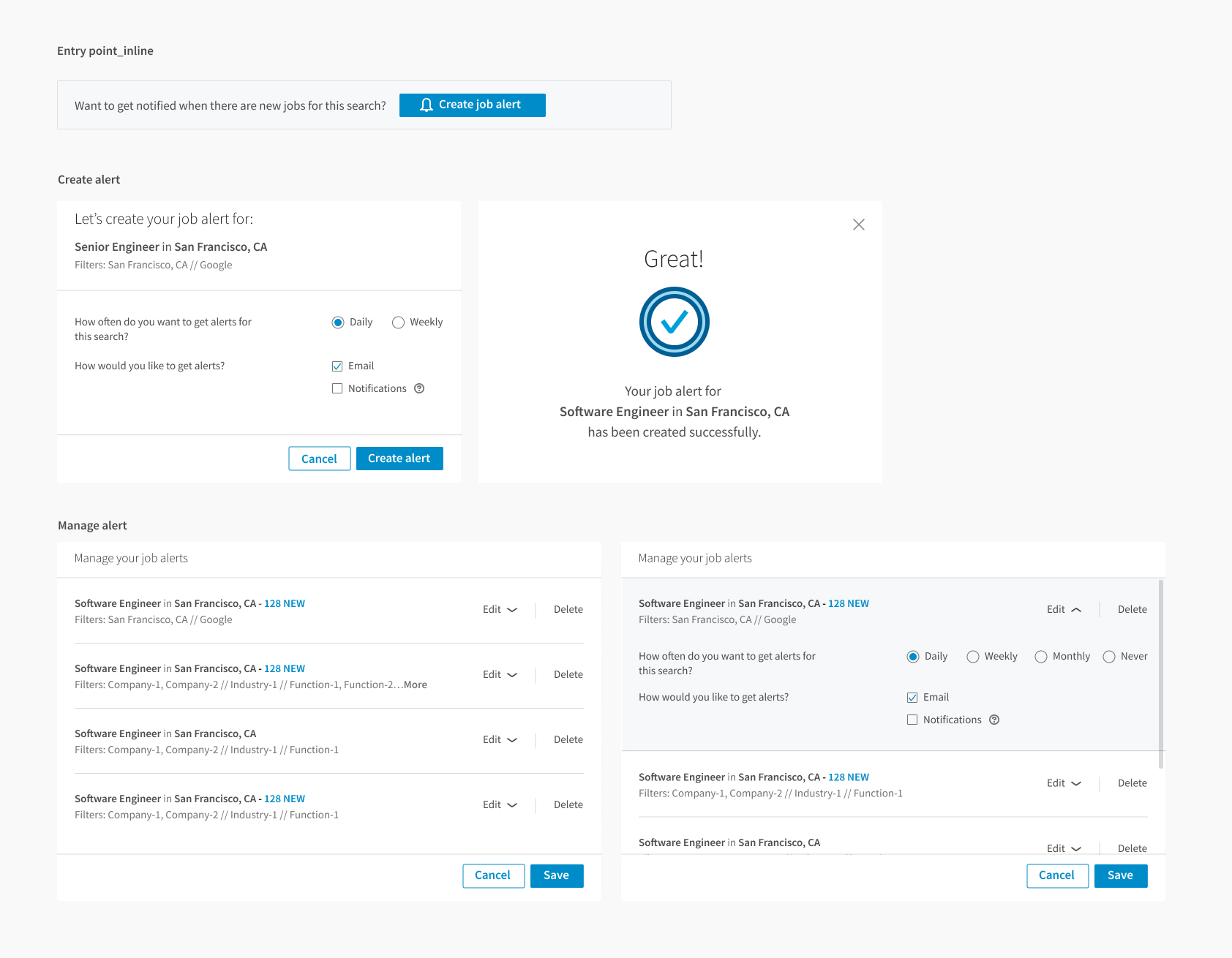
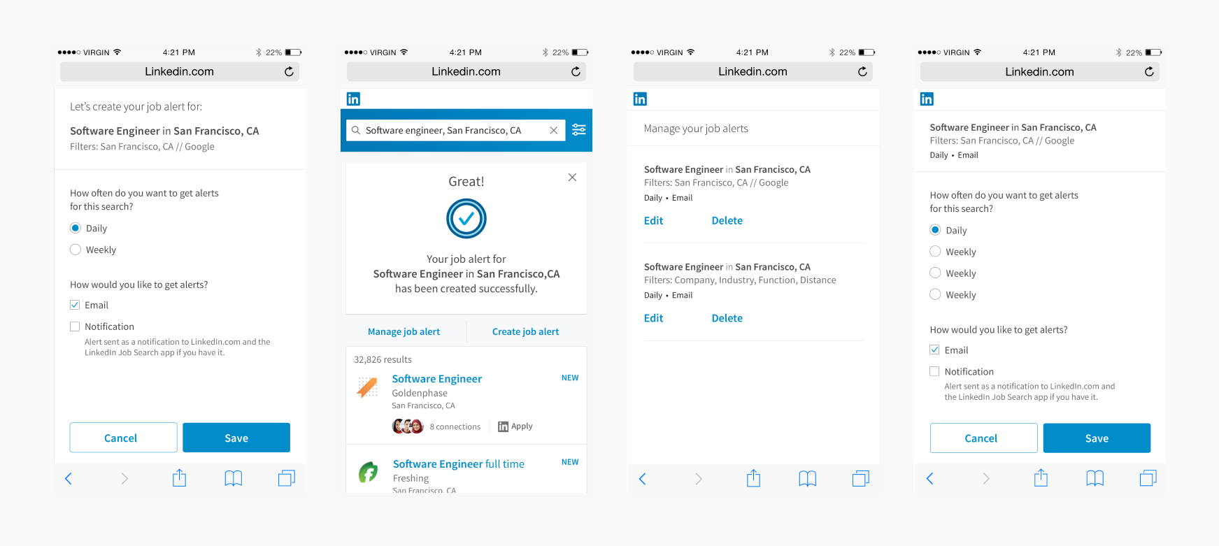
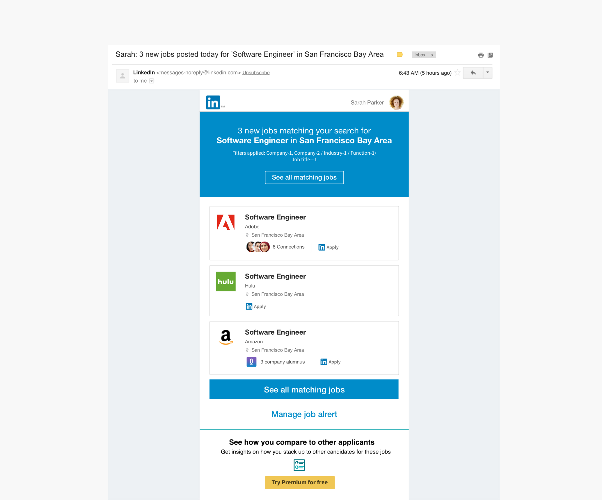
One of the most immediate takeaways from user research was that our job search was lagging behind for missing one important feature, job alert. Subsequently, we designed and delivered the job alert feature as a priority. The feature allowed users to save a job search query along with any applied filters, and it automatically finds jobs that are relevant to users and notify them via email and push notifications. We decided to go with a more plug-in type of experience so that we can test out the solution by various entry points to see where it made the most sense.
After the initial launch, the feature has proven to be imperial to retention. It works as a major re-engagement loop for the Linkedin job search. Another bonus surprise was the slight increase in member sign-up.
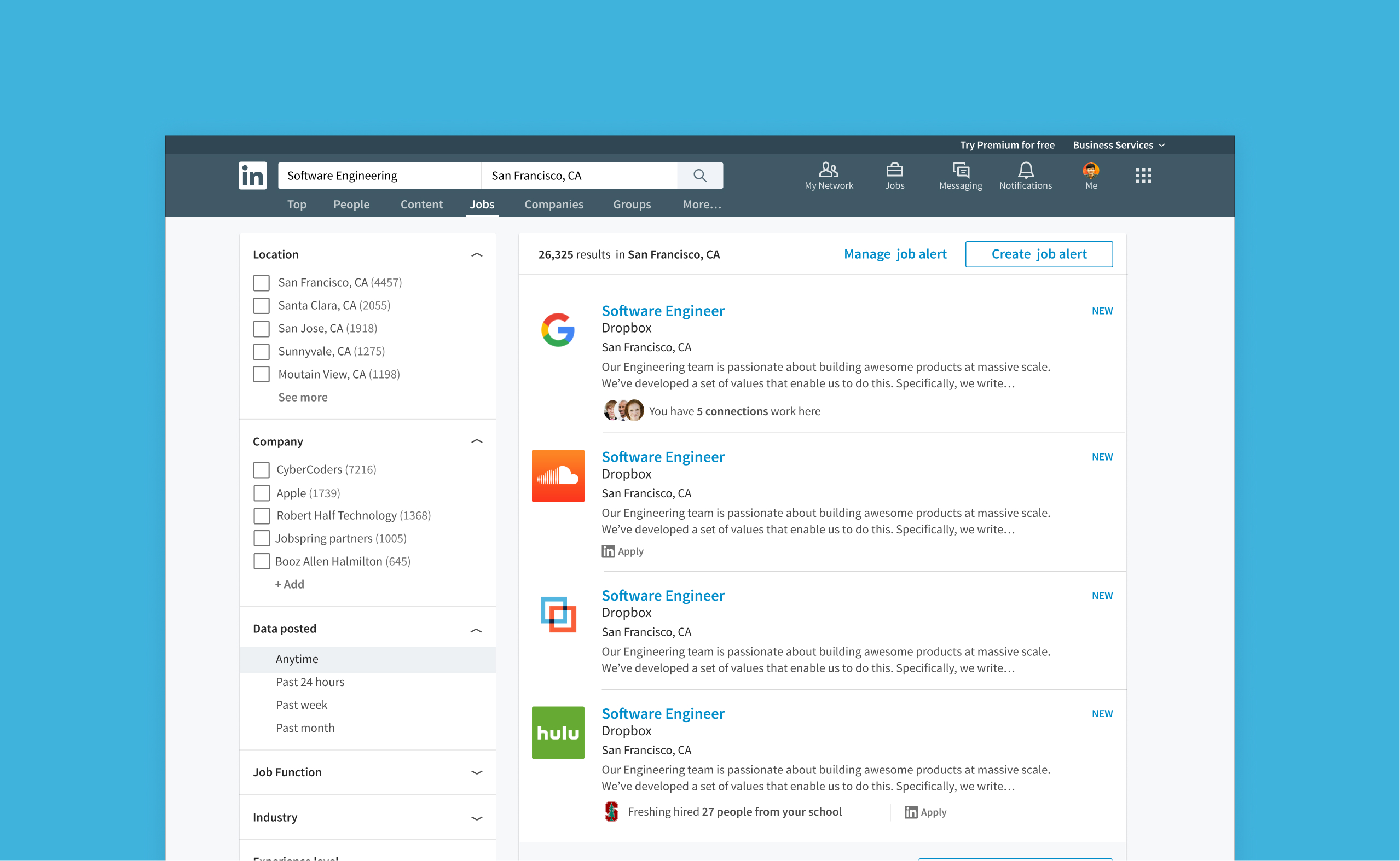
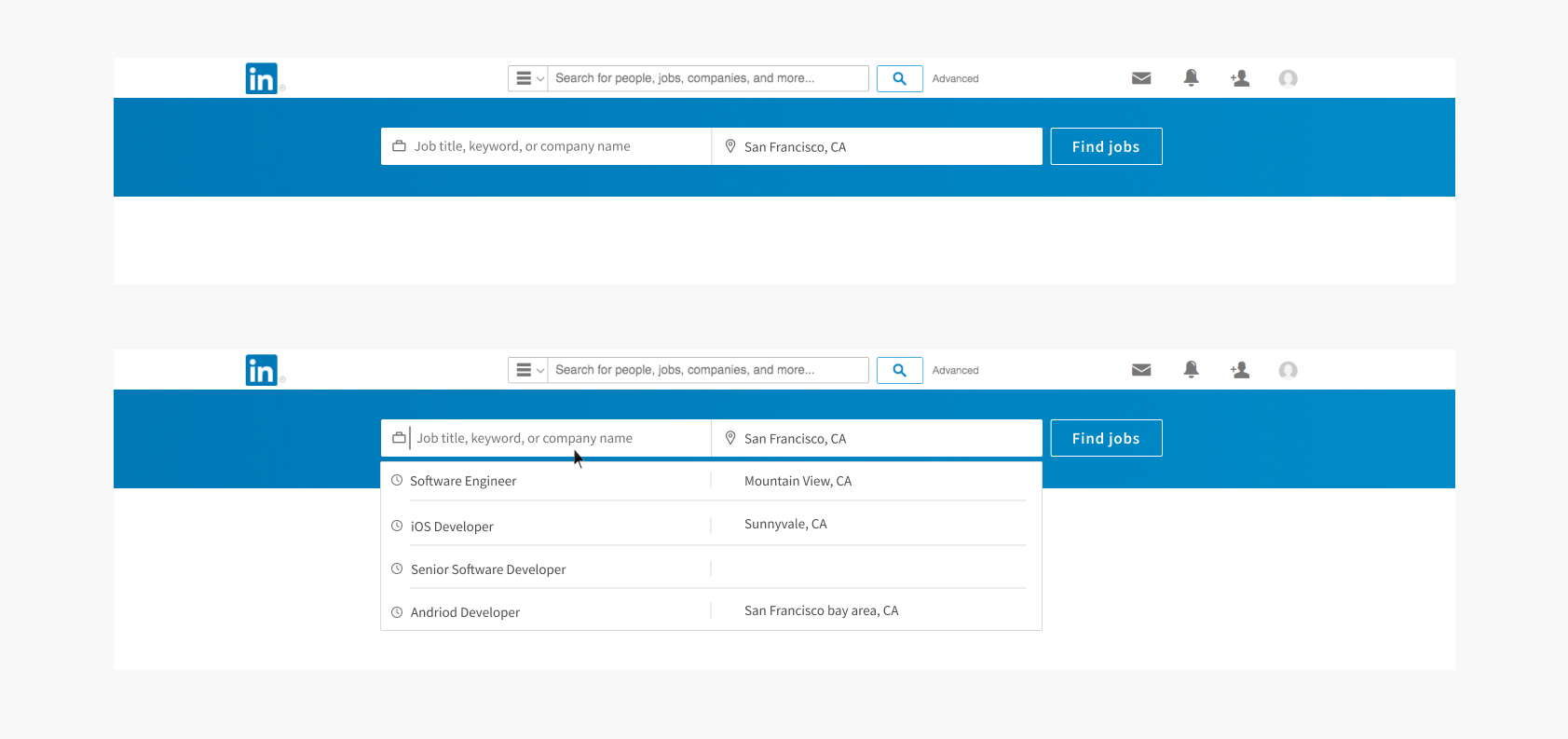
Up next was to improve the location search. The previous design did provide this function but it was hidden inside the filter and the usage was low. The immediate idea was to add a location search right next to the job title to bring visibility. It gave us more confidence to move forward with this idea when we looked into the job search query and noticed that users often search for jobs with locations in it.
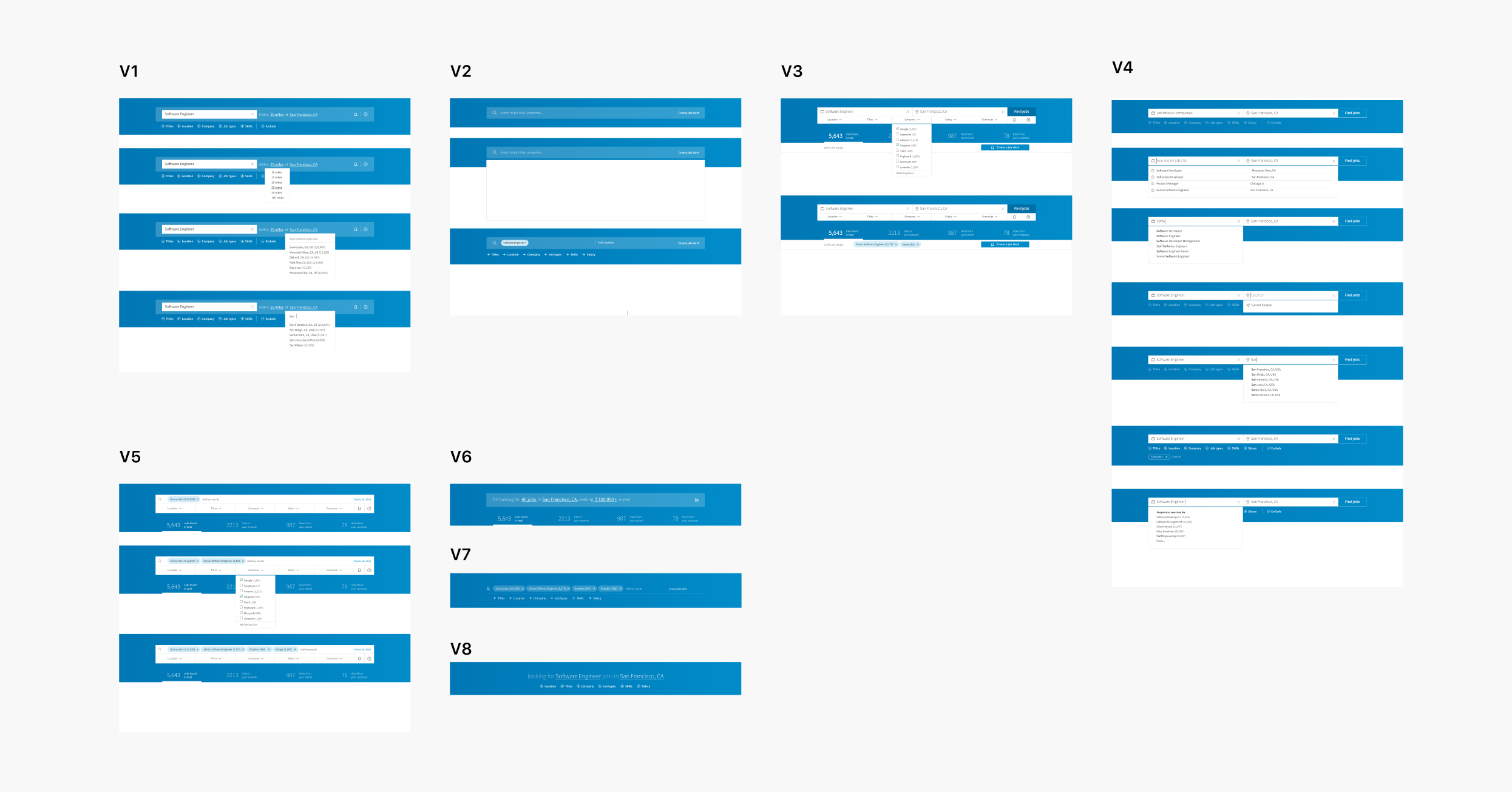
I went to the drawing board and explored numerous search interaction concepts. In the end, we went with a simple version of adding an extra search bar within the search page. The search logic was not fully baked with this concept but it served as an MVP to help us quickly validate our assumption towards the value of location search. As a result, the new location search increased the job click-through rate by ~3%, it was not a lot but a good enough sign for us to move forward.
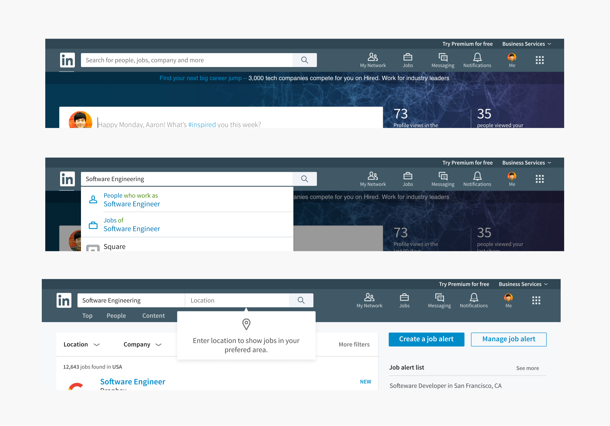
The new search design brought up a new challenge; how does the two box search work in the global search environment. The global search by that time also supports searching for company and people, with content and salary on the way.
For one month, I worked closely with the other search teams, header navigation team, and design system team to explore concepts of the interaction relationship between global search and local search.
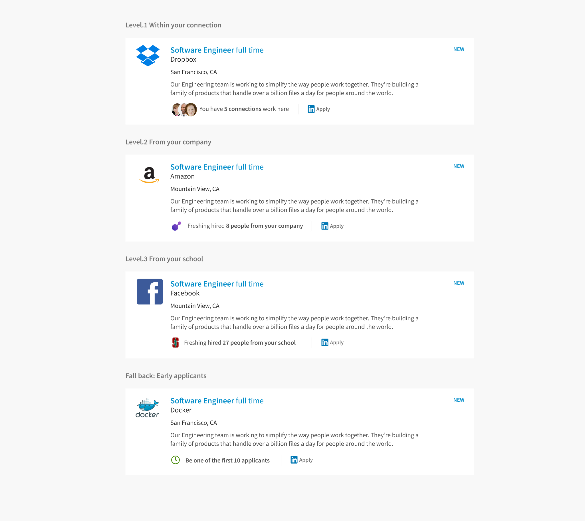
It had been an ongoing discussion that we were sitting on piles of networking data but not using any of them for helping users searching for jobs. The hypothesis was that if users were more likely to check out a job if they could see that they have connections who work there. And we would know we were right if there was a CTR increase in those flavored job listings. I worked together with the product manager and engineers to figure out the logic of connection insights.
The final design supported users to evaluate each search result based on their personal data such as their company and school connections. I also re-brushed the visual design of the job listings to make sure the newly added info could fit snuggly across platforms without adding more weight. The new design has a 21.3% increase in job click-through rate , which had proven to be effective.